
Articles
October 5, 2026
1 min read

Olsom Team
Articles
05 October 2026
4 min read
The hidden cost of manual reporting behind your OEE dashboard
Most plants already have a dashboard. Fewer can say how much of it was typed in hours later, and what those gaps are costing them.
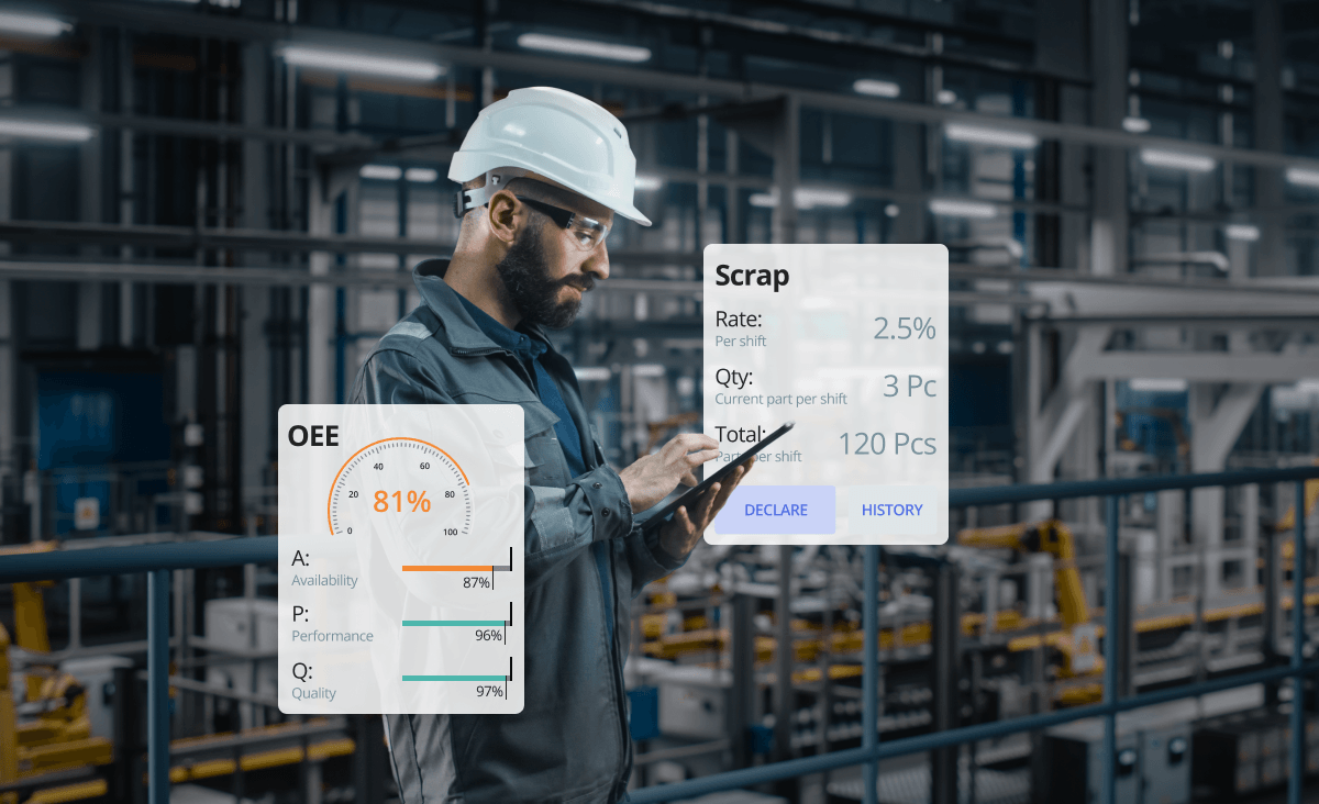
In this article:
It's Monday morning, and your OEE dashboard shows a respectable number for last week. Then a line supervisor mentions three changeovers that ran long on Thursday. You check the downtime log. None of them are there.
The dashboard is working as designed. It reports exactly what it was given, and when part of that input is typed in by hand hours later, the number on screen drifts away from what happened on the floor.
Why does manual reporting survive after MES and ERP?
Manual reporting survives because most systems capture machine data automatically but still rely on people to explain why a line stopped or why a part was scrapped.
The research backs this up. Rockwell Automation's 2026 Scaling MES Across the Enterprise report, 1,560 manufacturing decision makers across 17 countries were surveyed. It found that 93% have MES running in at least one facility. Only 23% report full integration with ERP, PLM, quality, and OT systems.
For plants without a commercial MES, spreadsheets remain the default. IoT Analytics estimates that 54% of plants worldwide used paper and spreadsheets to manage operations in 2024.
US manufacturers describe a similar picture. In Lasso's Q1 2026 survey of small and midsized US manufacturers, 46% rated their own use of data and analytics as manual or basic.
What's automatic and what gets typed in?
Process data and ERP orders usually arrive on their own. Downtime and scrap are where capture gets mixed: automatic on some lines, manual on others, and often both on the same line.
A PLC signal can timestamp a stop to the second. It can't explain the stop.
That explanation comes from a person, and so does the scrap reason. On lines without connectivity, operators type in the counts as well. When those entries happen at the shift end from memory, the dashboard still looks live, while the numbers behind it are a reconstruction.
Where the hidden costs show up?
Manual reporting costs more than the hours spent filling in forms. The larger loss shows up in the OEE number itself, which drifts away from reality.
Short stops that never reach the report
Operators reliably record a 40-minute breakdown. A 90-second jam is another story. Stopping to write it down takes longer than clearing it, so it never reaches the report.
Whether a plant books short stops as availability or performance loss depends on the threshold it sets. An unlogged stop costs the same time either way. It surfaces as slow running with no cause attached, and the team ends up chasing a speed problem that is really a recurring jam.
Unlogged short stops also distort the downtime Pareto. When only long breakdowns get recorded, they top the chart, even if frequent short stops add up to more lost time. Classification errors do similar damage: an unplanned stop logged as planned drops out of availability entirely.
Production counts that arrive hours late
Paper travelers and end-of-shift entry mean production counts reach the system hours after the parts were made. In multi-shift or high-mix operations, that delay compounds.
A supervisor ends up reacting to a pace problem that started two shifts ago, after the pattern has already repeated.
Scrap reasons recorded from memory
Scrap and defects are often counted and categorized at the end of a shift. Specific causes collapse into catch-all codes that nobody can trace back to a machine or a time window.
The scrap report still fills up with entries. Root-cause analysis stalls anyway, because the entries lack the detail an engineer needs.
Skilled time spent on data entry
Every hour a CI lead spends reconciling spreadsheets is an hour taken from finding out why the losses happen. Supervisors lose time too, chasing missing entries before each shift meeting.
Beyond OEE: other manufacturing dashboard KPIs that drift
OEE isn't the only number affected. The same capture gaps show up across the rest of a manufacturing KPIs dashboard, and each metric drifts in its own way.

What changes with a real-time OEE dashboard?
A real-time OEE dashboard shortens the gap between an event on the line and its appearance in the data, from hours to minutes. Each OEE factor starts reflecting the current shift instead of the previous one.
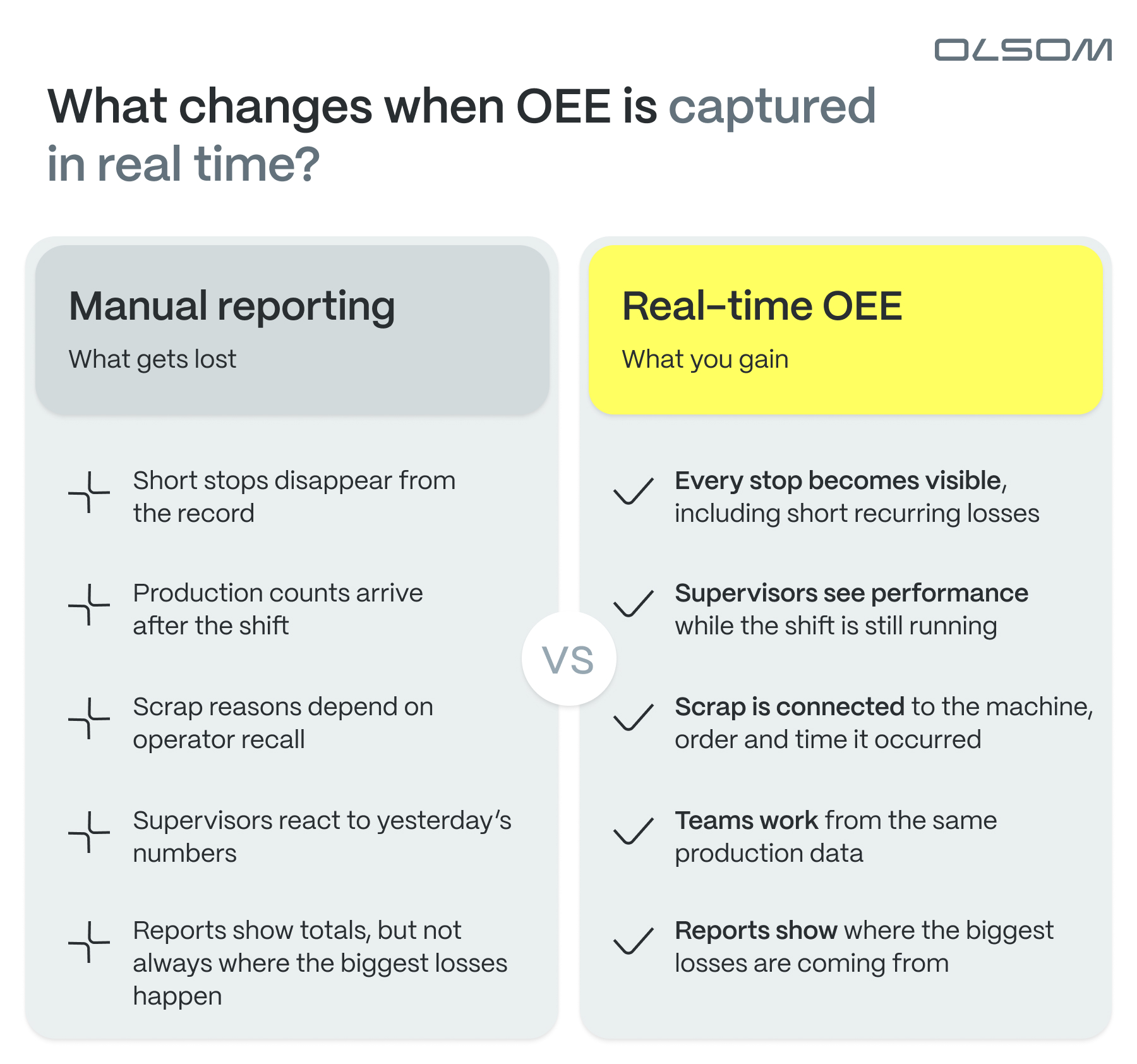
Every item in that right-hand column comes down to one difference: the data is captured when the event happens, not reconstructed when the shift ends. Two plants can run the same dashboard and still see very different numbers, depending on how much their machines report on their own and how much is left for someone to type in later.
How do smart manufacturing platforms track production in real time?
A signal from the line marks the moment a stop begins and how long it lasts, so much of the record exists before anyone writes anything. What no signal can supply is the reason: the changeover that ran long, the fitting that jammed, the material that arrived late.
A smart manufacturing platform connects the machine signal to the person who can explain it. It takes the stop from the machine the moment it happens, keeps it open until someone assigns a cause, and puts that prompt on a screen at the station where the operator is already standing.
That leaves the operator with one field to fill, seconds after the stop, instead of a whole shift to reconstruct at the end of it.
How far a plant goes with connectivity varies. Some connect every machine. Others start with a terminal at the station and no machine signals at all. Most end up somewhere in between, which makes the capture setup matter more than the dashboard sitting on top of it.
To see what this looks like in practice, here's how AGW, OLSOM's composable, no-code smart manufacturing platform, handles it. Process data such as pressure, temperature and torque flows in automatically for traceability, while orders and master data can come from ERP. Downtime and scrap are where most reporting gaps appear, so the examples below follow a stop from the moment it happens to the report a CI lead reviews.
Every stop gets a reason, including the automatic ones
In AGW, downtime can be recorded manually, automatically, or in a dual mode that combines both. In automatic mode, AGW captures the start and end of each stop from the line, along with a failure code when the machine provides one.
Stops that arrive without a cause are labeled Unidentified. That label keeps them visible until an operator picks the category and reason on the Visual Workstation, AGW's operator screen at the station.
Scrap follows the same logic. Sensors, cameras, and test equipment can report defects automatically. Operators can also declare scrap at the station, mark the defect zones on an image of the part and select the reason.

Supervisors see the shift while it's still running
Visactory is AGW's real-time production dashboard, built for screens on the floor as well as PCs, tablets and phones. It shows live KPIs, including downtime duration for the current shift and the top downtime and scrap reasons.
End users set up their own Visactory screens, choosing the layout, the KPIs and the locations the data comes from. New dashboard components and most report customization are handled with OLSOM's services team.
The same data can roll up across plants. At one global Tier 1 automotive supplier, each facility used to build its OEE report by hand in Excel, and corporate teams couldn't fully trust the numbers. With AGW tracking OEE at each plant and Global Visactory consolidating the data, management now sees every facility's performance in one real-time view, and plant leaders compare results on the same numbers.

Reports point to the losses that cost the most
Downtime reports usually reveal the most hidden cost, since unplanned stops tend to be a plant's most expensive loss. The duration by type & machine report splits stop time into breakdowns, maintenance, organizational issues, technology, and changeovers for each station or work center.
The OEE details report shows whether availability, performance, or quality is pulling down a work center. On the quality side, scrap reports rank losses by reason, station, and part in Pareto charts and show the scrap cost per station.

Is Your OEE Dashboard Lying to You? A two-minute check
Before looking at new tools, it's worth testing how far the numbers you already track can be trusted. Take two minutes with these questions:
- Can you trace last week's top scrap reason for a specific machine and time, or only to a category?
- How many hours pass between a stop on the line and its appearance in the report?
- Would this week's OEE change if every stop under two minutes were counted?
- How much time do supervisors spend each week compiling shift reports?
If you hesitated on more than one, your dashboard is probably reporting a more comfortable picture than your floor delivers.
The real cost is the decision you made too late
Manual reporting rarely fails in an obvious way. The dashboard keeps updating, the meetings keep happening, and small losses stay out of view.
The expensive part comes later, when a quality problem or a recurring stop gets noticed days after it could have been fixed.
If you're not fully sure your OEE number is accurate, it's probably not the only blind spot on your floor. The Manufacturing Blind Spots Checklist covers six loss drivers that standard KPIs and many MES or ERP setups miss, from TEEP to scrap cost impact.
6 metrics your current KPIs likely overlook
Most plants track OEE and downtime—but hidden losses still add up. Check your blind spots for what's quietly draining your performance.


.png)

Smart solutions that adapt to your unique operations

2026 @All Rights Reserved
Made by SNIG